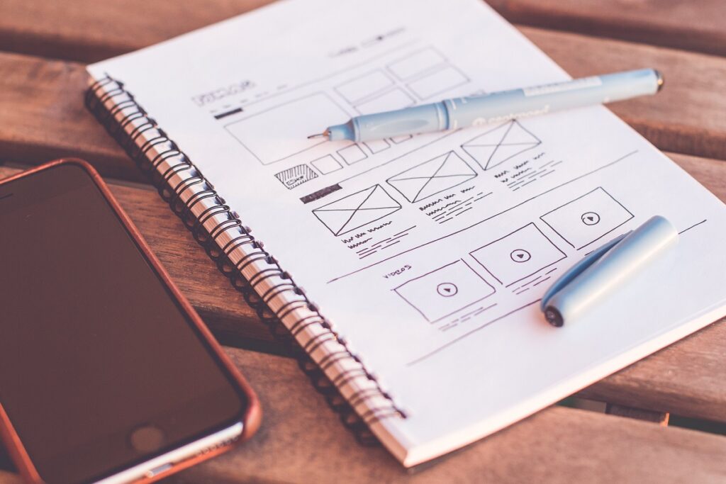
When we talk about web design, the first thing most of us will think of is a unique concept, appealing visuals, a website that grabs the attention and is attractive and pleasing to the eye. Creating a beautiful, unique-looking website is not an easy task and when you add functionality on top of that, things can get very messy very quickly. The insatiable desire to stand out from the competition (which is rapidly growing as you’re reading this) can easily overwhelm you and cloud your judgement, so you end up making some major web design mistakes.
In this post, we will cover 15 of the most common web design mistakes and share tips on how to fix them or avoid them altogether, regardless of your level of skill in web design.
And in case you’ve missed it, here is our article about which key elements to look out for when creating your web design.
Basic Web Design Mistakes
You keep using invisible menus
Let’s start with the basics. Navigation is crucial for a website as it helps your visitors to know where they are and where they want to go from there. In an attempt to achieve a clean and minimalist look many designers choose the so-called ‘hamburger menu.’ To be fair, this looks very modern and gives the website a more contemporary appeal, but web visitors typically look for visual clues to navigate a website. If they can’t easily find what they’re looking for, it’s very likely they will click out. So, instead of the invisible, opt for a simple menu at the top of the website.
You leave no room for whitespace
Having a website that is so busy and colorful is one of the most common web design mistakes out there. Negative space, or whitespace is very important in web design because it creates balance and lets the visitors focus on what your website is presenting. In turn this means that your website will have a better visibility, readability, as well as improve the attention and comprehension of the user.
The lack of negative space not only looks chaotic, but also makes the browsing experience too overwhelming.
You’re overusing the whitespace
Contrary to the lack of whitespace, another mistake in web design is using too much of it. When a website shows too much negative space it makes it difficult for the user to focus and it lacks clarity.
Your background and font color lack contrast
Contrast is becoming more and more recognized as a crucial element in design, and it’s a web design mistake we see made way too often even by designers. Even though the color you’ve chosen may look incredible in your color scheme, if the contrast is too low it can impair the website accessibility.
Luckily, there are helpful tools such as the contrast checker on WebAIM which you can use to see if the colors you have picked are a good choice and legible to your website visitors.
Typography Mistakes
Font size (and style) matters
When it comes to typography, less is more. Steer clear from fonts that are illegible or too ornate, as this reduces clarity for the reader and increases the chances of them leaving your website.
Another thing to keep in mind is that the font you’ve chosen should not be too small. Miniature font is difficult to read, and many users will not bother to zoom in and read the text.
On another note, pages that are text-heavy, like articles and blog posts may even benefit from larger fonts.
Uppercase is good…sometimes
Using all caps can be useful, it draws attention, particularly when highlighting points in your copy, or when it comes to headlines or subheadings. However, unless it’s just a few words, avoid using all capital letters for longer copy, as this is very difficult to read.
How many fonts is too many fonts?
There are no rules when it comes to how many fonts you can use on your website, but the general rule of thumb should be two to three at most.
And even when you’re using only two fonts, these have to correspond and work well together. Choosing fonts that are too different in style, can look tacky and a bit tasteless.
If you’re having trouble choosing two or more fonts to combine, try Typewolf to get inspired.
Image Mistakes
You use low-quality images
Using low-quality images that appear blurry makes your website look incredibly unprofessional. Regardless of if you’re using stock photos or custom created images for your website, make sure to upload them in a higher resolution and test your website on large screen sizes to see what they look like.
On the other hand, images that are too large will slow loading time which in turn will increase bounce rates. Steer clear from TIFF file formats, and instead use the more common ones such as JPEG, PNG, or GIF.
You skip the image meta data
This might seem like it’s not so important, but image meta descriptions help with the SEO of your page. Keep the meta short but descriptive, including relevant information for the image, as well a keyword.
Your images are too generic
There is nothing wrong with using stock photos for your website, whether that is for your blog section, or a newsletter, however, keep in mind that stock images are heavily used by other competitors in your industry.
If you’re using databases like Unsplash or Pexels, when you search for images, try digging deeper on the website and don’t just download the first photo from your image search results.

Content Mistakes
You have created too many pages (or not enough)
Unless custom designed, website creation through a template can become confusing if you try to fill every page available. A good web design should have the most important pages and avoid additional ones that only create chaos. If you’re unsure which pages to include and which ones to avoid, make a sitemap. A good start for your pages would be:
- Home
- About
- Services
- Blog/News
- Contact
- Policies
Your copy doesn’t speak to your target audience
Stuffing your website full of copy without saying anything of significance is a very common mistake, but an easy one to avoid. By doing some research and getting to know your target audience and your ideal clients you’ll be able to create content that they will love to consume.
Another important thing to note is to keep your content customer centric. Even though you might be selling a product or offering a service, it is crucial that you don’t ignore your visitors’ wishes, problems and desires. By addressing this your raise credibility and you show how they benefit from choosing you, turning them from a visitor to a client.
You write content that is not scannable
This tip is particularly important for articles and blog posts. Dividing longer texts with headings and subheadings is helpful for your website visitors to find information that they find relevant. In addition, make sure you use bullet points as well as images when highlighting important parts in your written content.
And get this – using headings and subheadings with your keyword included helps Google rank your website higher in the search engine!
Usability and Other Web Design Mistakes
Your Call-to-Action is unclear
Each website has a goal to be accomplished by its visitors, such as to purchase a product, to inquire about a service, or to read an article or a blog post. This is why you need to use a clear and decisive call-to-action in order to steer your potential customer in the right direction.
However, one thing that is worse than having an unclear call-to-action is attacking your website visitors with CTA from every corner possible, which can feel downright annoying.
Your webpage is not responsive
You might hear this too often but with a good reason. Using responsive web pages improves the website accessibility making sure every visitor has a good user experience regardless of the device they’re using.
Your webpage loading time is too long
We have talked about this in previous articles, but we cannot stress it enough! The average internet user is very impatient, so if your website takes more than four seconds to load – this means you’re too slow and you’ve lost a potential customer.
According to Google, the best practice is three-second load time, adding that at least 70% of websites’ loading time takes an average of seven seconds.
You haven’t added a favicon
A favicon is the small icon that is displayed in the browser tab next to the page title. Adding a favicon makes it easier for a user to find your tab and return to it from a different tab, especially if they have multiple tabs opened in their browser.
Final thoughts
Web design is not an easy job and there are so many things to keep in mind when you create a website for it be useful and help you achieve your goals. But having said that, it’s not rocket science, and in the end, most mistakes are fixable.
Make sure to focus your website on your visitors as they are the ones who use it and drive traffic. They are the ones that could turn into customers if you did a good job with your web design.
What are some web design mistakes you’ve recently run into?
