We all love a good web design! Each year something fresh and new enters the design game. Of course, the list of web design trends for 2022 will surely not be short of this. However, if we look back and try to find a meaning of how things in the segment of web design came to this stage, we can actually see a pattern of constant repetition. Not in the sense of bouncing back and forth with the same design patterns, but more as a constant inspiration extracted from how it used to be and assembled to fit the contemporary design narrative.
The same thing applies to the web design trends for 2022.
After careful roaming through the internet, we noticed an increased presence of website designs that incorporate playful elements, artsy layouts, or bold approaches. Therefore, it turns out that designers have started a trend that resembles the first years of web design where the focus of every designer was to show off and offer a unique view of its designing skills.
So, it seems like web design is always oriented towards the future and the latest technologies. Although for the most part, this is true, there is always a pinch of retrospective involved. To be precise, this retro aspect gives freshness to the newest technology trends and the result is a website that will catch everyone’s attention.
With all this said, it is time to take a look at some of the most compelling web design trends for 2022.
Let’s dive in!
Abstract Graphics
These days drawings and graphics directly coming from the creator’s hand are seeing an increase in popularity. Although vector graphics are still present and used by numerous websites, it is likely that people like to see a more natural approach to the design game.
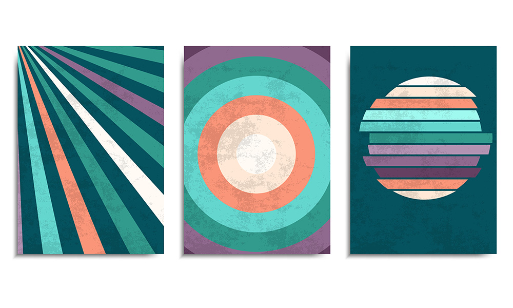
Therefore, textures and certain irregularities that are a common appearance in these settings have become the new flow. Using paint, ink, watercolor, paper texture, or silkscreen effects is the crucial feature of these designs. The author also uses smooth lines that do not perfectly resemble one another. In fact, this also depends on the technique the author incorporates.
Retro Touch
As we have mentioned a little earlier, the historical retrospective plays a crucial role in today’s trends and will even be a sure shot in the web design trends for 2022. Modern web designers cannot fall short from looking back at the beginning of the website design or the period in the 90s.
The beginnings were somewhat excessively rudimentary and all over the place. The colors were bright, the layouts of the tables were visible, and the fonts that were used were robotic.
All of these feature mix-ups resulted in grotesque and sometimes hard to look to designs.
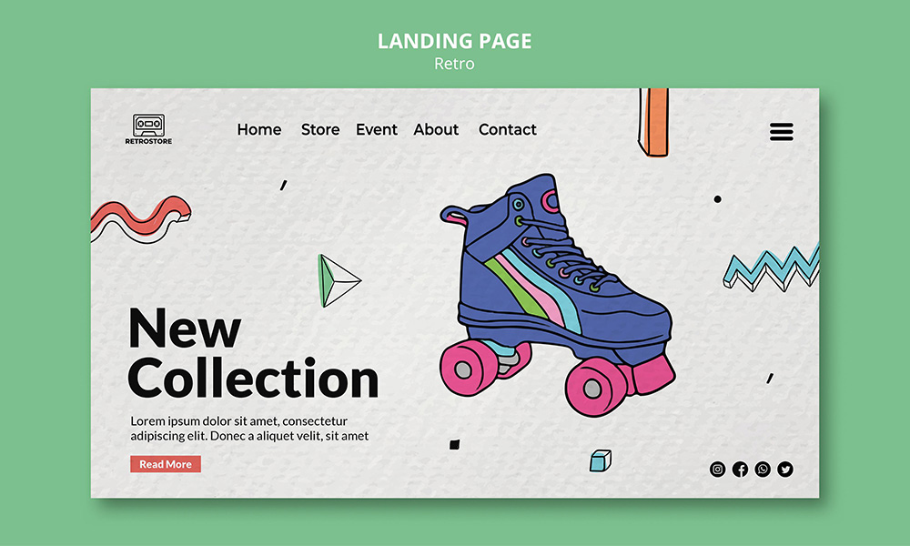
But contemporary web designers have a very important advantage when looking at this blast from the past. This advantage is called: 30 years of web design. Yes! Designers of today, can easily view the past design efforts through the prism of this collective experience and learn to incorporate only the valuable parts or the parts that can be easily transformed.
Another reason why designers are finding their inspiration in these starting phases of web design is the unrestricted creativity which was the driving force of these historic times.
Hovering Engagement
Over the years, there was a slight improvement in the animation game when it comes down to web design. Designers saw an opportunity in this and since then have been trying to come up with the most interactive techniques in order to keep the visitor animated. Let’s admit! Visiting a page where despite the designated buttons, the visitor can play around with certain elements, will definitely catch our attention and make us value it a bit more than a standard one. If there is something else going on e.g., an interactive background that changes if hovered over a certain area, or a color-changing pattern, we as human beings are immediately animated and spend even more time than we should. Not that we are making plans on how long we are going to stay on a certain website, but the overall experience regarding interactive websites is that they tend to make the visitor stay a bit longer and explore it.
The interactions may vary and include actions such as clicking, swiping, or dragging. The most important thing to remember is that the visitor should be a bit mystified in order to have an interactive experience. Therefore, websites that contain some mysterious objects or some non-traditional way of displaying certain fields, tend to perform much better than the plain and simple ones. People want to investigate so giving them this on a website will surely mean more traffic and decreased bounce rate.
Typography on the Move
Typography is one of the crucial elements of a great web design. Animation is also a feature that will always catch the attention of visitors. So, what about combining these two? Well, web designers are already thinking ahead of it and bring you typography that moves. Of course, that animating certain portions of a website is nothing new, but it seems as though the animation part was always reserved for the website’s graphics, the elements of the UI, and the page transitions. In fact, this is the main reason why animating the text might come as a novelty in terms of web design. However, the animation must be subtle and not overwhelm the reader. For example, a circular rotation that will intrigue the visitor and not bring confusion. This will certainly make moving typefaces one of the web design trends for 2022, giving life to the simple but powerful messages that websites want to present.
Scrolling in style
Scrolling is one of the most used actions a user engages in while visiting a website. That is why, with some tweaks here and there, this action can be included as one of the web design trends for 2022. Of course, there must be an interaction that will take the visitor on a journey through the website. Incorporating animations within the scrolling experience can slightly change the attitude of the visitors. The element of surprise additionally gives value to the overall contact. Nowadays, web pages are providing outer world experiences, vivid images, distorted vision, and getting playful with dimensions.
Handcrafted Designs
Despite the fact that the world of design is now fully oriented towards digital tools, the hand-painted designs still made it to this list of web design trends for 2022. There is something about those imperfect drawings that draw the attention of the audience. In fact, these ‘flaws’ are exactly what makes these designs special and more relatable to people.
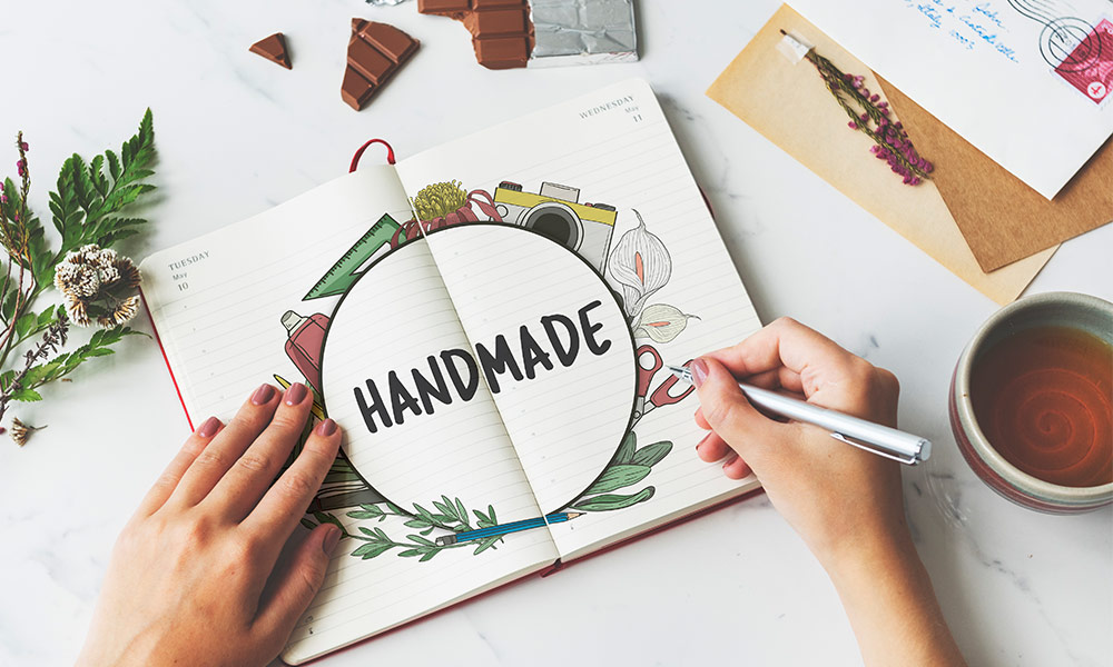
Various doodles, cutouts, scribbles, and textured paintings that portray watercolors and crayons are perfect examples of how these traditional artworks can find their way into web design. Ultimately, their role is to serve as vessels for connecting the offline world with the online experience, through a more personal approach.
Typographic Hero
The hero image is something that visitors first see when entering a web page. Therefore, the newest trends show that designers use the hero for implementing typographic imagery. The reason for this new trend is pretty simple: it allows a clear message to be communicated with the visitors. More frequently than not, these typographic images contain bold fonts that resemble a news article. This way you can easily get the attention of the website visitor and convey your intentions. On top of that, you can easily present some mesmerizing fonts.
Apparent Borders
Websites are built on grids, and they are all connected and powered by a code. Of course, everything you see is powered by a background code that arranges each and every detail of a particular website. One of the numerous web design trends for 2022 is giving the borders a bit more visible definition. In essence, the layouts will be simple, with subtle frames and borders that will perfectly distinguish the sections of the web page.
In a Nutshell
After carefully selecting the most popular web design trends for 2022, we cannot help but notice that each year there are numerous new trends making their way in the world of web design. Additionally, we are witnesses of how old trends are making a comeback as well. Looking in the past for inspiration is not something strange in the world of design. Combined with the tools that exist today, these retro trends can be everything that they could not be in the past. However, there is one thing that will always be number one in terms of web design, and that is its uniqueness. Therefore, incorporating your own unique styles into your designs will definitely put you in a more favorable position in the web design market.
