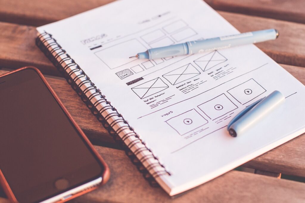
In today’s world, where the internet is one of the pillars of human existence, lacking a quality visual and user experience based on the core web design elements would be somewhat crazy.
Although this statement might sound a little bit pretentious, if we put it in the context of contemporary web design solutions and how the audience is perceiving the visuals in the interaction process, we can come to the conclusion that the positive feedback could only be earned by incorporating the core web design elements, cumulatively.
In fact, having a good web design will help your company and business reach the target customers and will be an overall boost to your digital marketing strategy. It is a fact that in order to tailor a strategy that will have a successful outcome, you will need a solid foundation expressed through a seamless web experience.
Ultimately, an effective web design is not just a visual piece of information that looks appealing for the potential customer, but an additional set of standards that will help your website earn a higher rank by Google. These standards include some off-page and on-page SEO tactics that can be positively assessed by Google, creating your way to certain online visibility.
With all this said, there are numerous web design elements that can make your website attractive and optimized, but it all comes down to the core ones that must not be omitted while building your website blueprint.
So, what are the building blocks of a good web design? We are going to answer this question and some additional ones, by presenting the core web design elements every website should incorporate.
Easy Navigation
One of the first things we notice once we open a certain website is its accessibility and the way it loads all the pages. The rule here is that your customers have to always know where they are on your site, so they can easily navigate their way to another page by their liking. Many businesses go with an interactive approach in terms of navigation which is a great way to keep your clients animated while they are scrolling through your website.
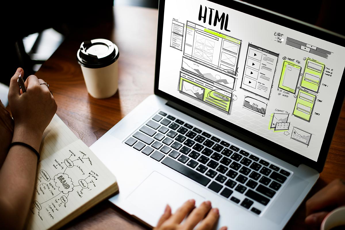
However, be very careful as sometimes interaction can turn into an overwhelming experience for the viewer, which will ultimately end with losing a potential client. Therefore, adding a bit of interactive touch is just enough in order not to chase away your clients. Remember, what you need to offer is a functional website and not an interactive gamified experience.
Mobile-Friendly Design
According to Statista, mobile devices make about half of the world’s website traffic. The statistics show that in the first quarter of 2021, mobile phones alone have generated 54.8% of the web traffic on a global scale. As of 2017, this indicator is constantly floating around 50%. In essence, this trend is caused by the emerging digital markets that skipped the desktop phase and moved straight to the mobile internet. Such emerging markets are countries like India, Nigeria, Ghana, and Kenya that due to the low infrastructure and finance restraints opted for the mobile internet option. In contrast, the US market’s mobile usage accounts for 48% of the online traffic.
The main characteristic of a mobile-friendly design is its responsiveness. We say that a web design is responsive when it is seamlessly optimized to fit any device it is opened on, without giving hard time to the user in terms of the overall experience. In fact, this is reached through optimizing the text, the UI elements, images that appear on the website, and other elements that might influence the user’s viewpoint.
In this regard, avoiding the implementation of a strategy based on responsiveness means an immediate loss of credibility, and will definitely reflect on the segment of web traffic, which in turn will lead to plummeting revenue.
Recognizable Color Palette
Another one of the essential web design elements is the color scheme. The usage of color is very important in attracting new customers. There are numerous studies conducted in order to identify the connection between a color and the symbolics it holds. All these studies are the product of inspecting customers’ behavior and how they perceive the services certain companies provide. In addition, each color sparks a different set of feelings in consumers so based on that many companies tend to invest time in discovering the most suitable color scheme for their business.
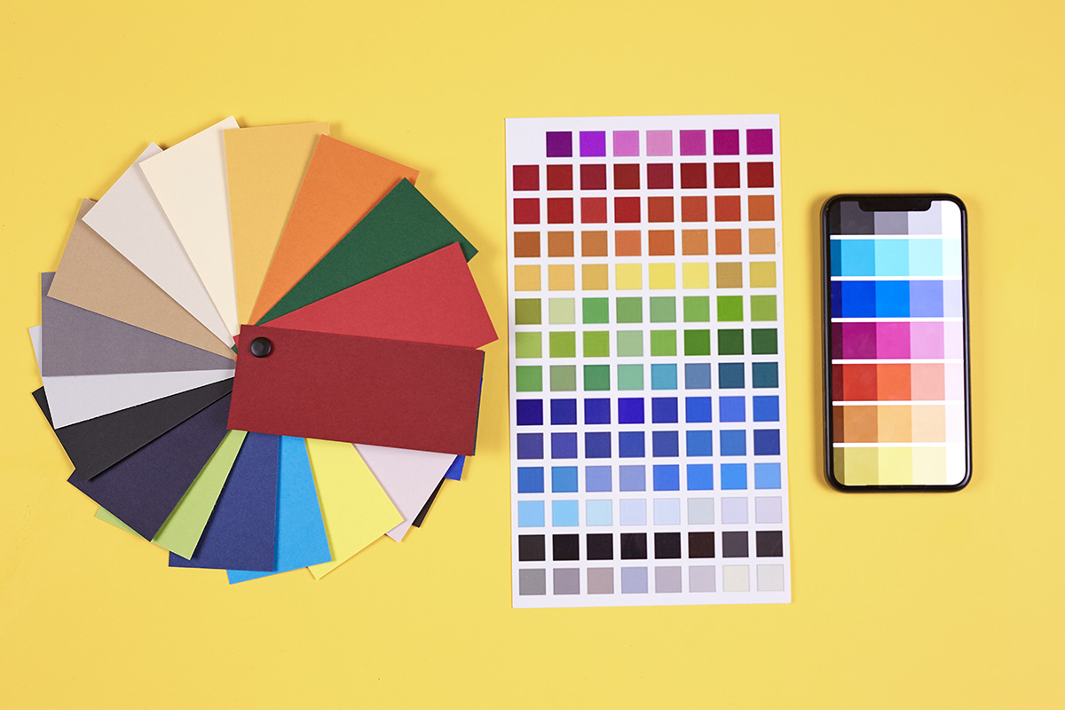
In general, companies use two main colors when they present their products and services. This way they make room for different combinations while creating new elements for each part of the website.
Using too many colors will distract your website visitors and might cause them to lose their focus. Huge companies such as Amazon or Apple, are perfect examples of how a limited color scheme can create a strong and recognizable brand. If you want to know which colors are going to be trendy in 2022 you can check the Design Shack post about trendy color schemes and find your perfect color palette.
Typography
Choosing a font that will make your company stand out is another one of the core web design elements. Nowadays, many businesses opt to take a minimalist approach in this regard, offering clean and bold typography. There are several elements that create the ultimate typography and those include:
- Fonts that are standardized for online usage and can do well across different platforms
- A text that is sized in the right manner, not smaller than 16px
- Space between lines of text that will alleviate the reader’s experience
- According to the background of the website, black or gray font is advisable.
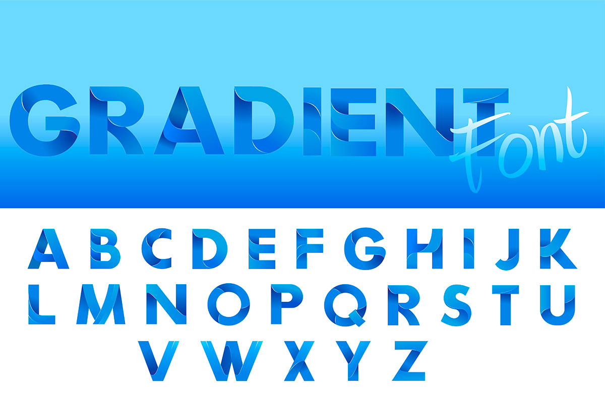
In essence, through typography companies want to fortify their brand identity. There are numerous businesses that are easily recognizable through their font. For example, Facebook, the social media giant, used Klavika Bold for its logo design which is immediately familiar once it is seen by users.
Website Speed
According to Unbounce, websites that load in a timeframe of 3 seconds have a far lower bounce rate of 9%. By contrast, websites that load for 5 seconds have a much higher bounce rate that amounts to 38%. So, a rather insignificant 2-second delay slightly increases your bounce rate.
This indicates that the visitors are not staying long enough on your website. In order to address this problem, you need to make sure to fully optimize your website in terms of loading speed. To do this, follow these five simple steps.
Reduce Image size
Images are an integral part of any website, but their size might slow down the loading speed. The solution lies in compressing the files in order to make them smaller in size, but without reducing the overall visual quality.
Use a CDN
CDNs are groups of servers that are geographically distributed around the world. The Content Delivery Networks can host a version of a website and load it in its entirety before a designated audience. This is very important as websites hosted in Australia, will have a very high loading time if opened by users in Europe. In order to avoid this problem, you need to host a version of your website in the European region, and this can be done by using a Content Delivery Network.
Reduce Code in HTML, CSS, and JavaScript
Codes that are larger in size can also increase the loading time of a web page. Therefore, removing some irrelevant code lines, overwhelmed with commas, spaces, or characters that are non-essential will make your website load way faster. There are numerous tools that can compress files in HTML, CSS, and JavaScript and reduce them to optimize the overall experience.
Maximize Server Response Time
While this statement depends on other factors such as the hosting solution, the software that is used, the amount of website traffic, and the resources that are used by each page, it is advisable that you use a reliable server with a high-performance rate.
Minimize the Use of Redirects
Although redirects might come in handy when you are dealing with a great number of content changes, using them in a higher number would lead to additional HTTP requests. The generation of this increased number of requests can have a very negative impact on the loading time of your website. Therefore, be careful not to always opt for redirects.
The Element of White Space
Every contemporary web design must incorporate white space areas in order to keep up with the minimalistic trend. Placing too much content on your website is never a good idea as it will immediately chase away clients that will feel overwhelmed by only looking at your website and will not even bother to read what your content says. A well-organized, tidy, readable, website will always steal the attention of anyone that will open your page. Additionally, people would like to stay and roam through your pages if they are given enough space.
SEO
SEO is another one in the pool of web design elements that can have a great impact on the website’s overall success score. Many of these principles are implemented in the background but their incorporation is crucial for your Google’s ranking.
Meta titles, meta descriptions, tags, focus keywords, content structure is only one small segment of the tweaks that can be done in order to fulfill Google’s criteria for ending high up in the SERPs.
Valuable Call to Action
The purpose of your business website, and any other website in general, is to convert visitors into leads. This is because websites are designed to serve as a connection between your company and people that show a certain interest in your service.
This process begins by placing content that will be enticing for the potential customers. You can use email marketing, newsletters, subscriptions, whitepapers that are free to use, and many other means of communicating the main message with your clients. While doing this be sure to include an engaging Call to Action or CTAs.
By doing this you can collect information from your potential clients, which will open your path for advancing this connection and converting them into your customers. Place the relevant CTAs in segments of your website that will provide an optimal distribution. Such places are the Resources page, the sidebars, the end of blog posts, and the most important one, on the home page.
Card Designs
The use of cards as modern web design elements has increased its popularity in recent years. Well-designed cards are a perfect way to present your content while animating your customer. In fact, cards always bring freshness in the field of web design as they are fusing text and images together, building an interesting and attractive element. You can tease your customers with clean image designs and short and appealing titles in order to get them to click on a certain card and continue their journey through your website.
Vivid Hero Images
Lastly, our list of web design elements will not be complete without mentioning the hero image. The first thing you see when you type in a certain domain name and press enter is an image that represents the certain brand you have searched for.
In order to appease the eyes of your potential customers, it is highly advisable to use a vivid hero image that will captivate the attention of anyone that visited your website. High-quality images can have a positive influence on the behavior of your visitors and motivate them to stay a bit longer, or even look even further and explore the services your company has to offer.
To Sum Up
Building a website that will stand out and be a positive example in the world of web design will always be the number one priority of the web designer’s clique. The creation process will always incorporate the core web design elements that are crucial in order for a particular website to be up and running.
Whether you are the leading face of a company who wants to learn about some of the most important web design elements, or you are a newbie web designer trying to get a grasp of the concept of a good web design, this extensive list of guidelines will help you on your way.
At last, incorporating these web design elements will help your business thrive by prioritizing segments like user experience and functional design.
For a detailed service and an individualistic approach please do not hesitate to contact our design department. We will be eager to assist you!

